


Search the site
Better Designs, Better User Experience

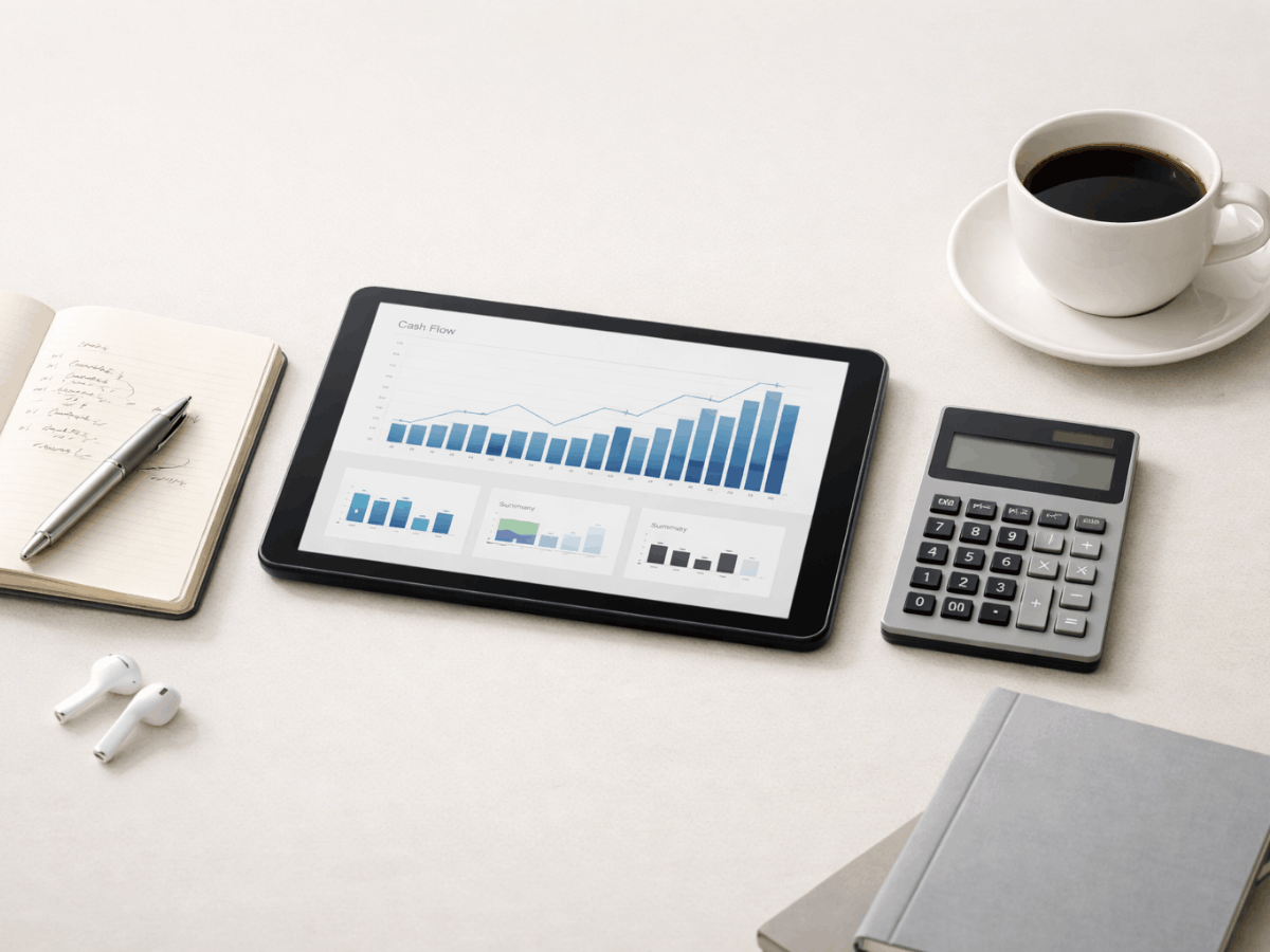
In the modern age, one of the best ways to start building a brand is to make a website. Most people use the internet--so if you want to get your name on the map when it comes to the genre of a product you’re trying to sell, a website is a great place to start. Still, it’s easier to say “I’m going to make a website” than it is to actually do it. With the help of Google’s principles for Material Design, however, building a website that is responsive, navigable, and pleasing to the eye is more than possible.
What is Material Design?
Rooted in Google’s Android operating system, Material Design is a set of principles that help to establish the best practices for creating web pages that mimic the material world. It’s grounded in the idea that we, as human beings, are most familiar with print materials because we’ve been exposed to them for much longer than the internet has actually been in popular use. Material Design, then, focuses on how we interact with the physical world around us and tries to mimic that on a screen. It’s a combination of visual, functional, and sometimes even audible design practices that are geared toward making the most user-friendly interface possible.
There are three main principles to Material Design:
- Material is a metaphor. With the design and content of a web page being completely digital, we can’t exactly take the “material” in Material Design literally. Rather, it’s a method of building your website in such a way that the design and content mimics something material and tangible in our everyday lives. It helps to build authenticity in the eyes of consumers.
- The main foci of your design should be boldness, strong graphics, and intentionality. You’ll want your website to stand out if you want to leave a good lasting impression on your consumers. Any moves you make when it comes to design should be bold and contain strong graphics that will make your consumers remember you. And you can achieve this through intentionality. Choosing your design intentionally, in a way that both reflects what your company or organization is about and serves its own singular purpose, ensures that none of your design goes to waste.
- Motion gives meaning. The lines and graphics of your web page should be designed in a way that either mimics or actualizes motion. This might mean arranging the contents of your page to align in a way that the eye is trained to follow as a means of keeping your audience on the page longer. It might also mean introducing actual motion into the coding of your web page through javascript or other animation-producing languages. Motion adds another layer of “the real world” to your website, and provides some much-needed nuance to your content that might leave it falling a little flat otherwise.
What does Material Design look like?
The overarching goal of Material Design is to take the tactile and visual aspects of the physical world around us, as well as design as we might see it in printed form, and to turn those into pixels on a screen. If it’s all about reaching your audience, you want to take what they already know and find a way to present that in a new format, and you want to make that presentation purposeful.
1. Sharp Corners and Straight Lines
Though this is not nearly as much of a hard-and-fast rule for Material Design as it might have been in the early days of its implementation, the use of sharp corners and straight lines in web design can be a very effective way to adhere to what your audience already knows. Because they mimic the edges of a piece of paper, which most audiences are most familiar with when it comes to print design, it can be a simple, but effective way to reach new audiences as well.
A crisp design with clean edges is also great for navigation because of the way it mimics a piece of paper. Readers will already be familiar with the page format and are less likely to get frustrated when their eyes don’t have to jump around a bright screen to find whatever it is they want to see next.
(Sometimes there will be curves as well)
Sharp edges might do a great job of impersonating a piece of paper, but that doesn’t necessarily mean they will always be the best design for your product. Keep in mind that none of these are hard and fast rules. Rather, they’re guidelines for you to think about as you form a page for your specific goals. There’s nothing rigid about them. So, if you want to throw in a curve every now and then or make it so that there are no sharp corners on your page, you can do just that.
The advantage of a curve is that it simulates motion and encourages the eye to follow a set path, rather than to stop abruptly like a sharp corner or edge might. There’s not a right or wrong answer to designing your website, but knowing the advantages and disadvantages of your options can help you to make more informed choices.
2. Drop Shadows, Bold Colors, and Layers
Either individually or in various combinations, these can help to add a realistic appearance to your website. If used correctly, they can give off the impression of being three-dimensional.
Drop Shadows
Drop shadows are usually placed around text boxes, post containers, sidebars, and, occasionally, images. They provide a suggestion of depth that might otherwise be missing from your page. Typically, the drop shadow is used to imply that a specific part of your screen is three-dimensional enough that if the light hit it the right way, it would produce a shadow.
Bold Colors
Depending on what the goal of your website is, bold colors may or may not be appropriate. Some companies and organizations, if the subject matter on their web page is on the more serious end, might instead benefit from using more subdued colors, but it’s really up to their own discretion. If you do think you might benefit from bold colors, however, they’re a great way to leave a lasting impression, especially if they’re reminiscent of the kinds of colors we in our real lives every day. Anything you can do to imitate reality on your web page is bound to put you in your audience’s good graces.
Layers
Layers can usually be achieved either by overlapping some of the content on your page or by creating several different pages for one website. The more depth your website has, the more three-dimensional and “of the real world” it looks, the more likely your consumers are to actually spend a good amount of time exploring your content.
The Mobile Experience
The mobile experience is a subset of Material Design which focuses specifically on the design and layout of mobile web pages. Like all Material Design, it must be intentional, and there are a couple different ways to do that.
Bottom Navigation
Whether it’s in an app or just a well-designed responsive layout, the bottom navigation is something you should definitely try to work into your mobile design. It’s usually the most effective way to let your users explore everything your website has to offer, while still keeping them anchored to one page.
It’s practical, especially in the case of mobile phones, where your users are going to be using just one hand to navigate, because the thumb is what’s most commonly used for navigation, and most people hold that towards the bottom of their screens. Containing it to the bottom of your page will make for a more simplified and streamlined mobile site navigation.
Simple Buttons
Buttons, usually depicted with some type of image to help indicate their functions, are a key part of navigation. They should be circular with an easily recognizable image so that users will know exactly where it is going to take them or what it is going to do when they click on it. Though in the past it has been suggested that button icons should match across all platforms, that is not so much the case anymore. As long as the image you’re using is easily recognizable and makes sense within the context of your web page, your users will love it.
The Product’s Role in Material Design
The product or content you are trying to sell is going to be the most important factor to consider when you’re employing Material Design because it’s going to influence every decision you make. From colors to lines to fonts to even the images you choose, you’ll want a streamlined design, and all of that is going to be based on the product itself. When you’re thinking about Material Design, ask yourself the following questions about your product:
What does it do?
The very function of your product is important to design because it can help to set the theme of your layout. Maybe you’re trying to sell airfare. If that’s the case, your web page might want to mimic what the world looks like in the sky. Your background could be the clouds a plane might fly through, the page arranged to resemble a control panel. Maybe you’re trying to promote a calendar app. If that’s the case, you might want a design that resembles both a traditional calendar and a planner. You could design it to have the traditional calendar as the main page, but a separate page that looks like a planner when you click on a specific date.
What feelings does it evoke?
The feelings your product evokes might have an effect on how well it’s received if your design strays too far from what is comfortable. If it evokes excitement, you might be able to get away with brighter colors and bold designs. If it evokes a bit of solemnity, however, you might be better off sticking to more subdued colors and classic designs.
How can you sell it?
Some of the time, your audience knows what they’re looking for and they seek you or your product out specifically. Most times, it’ll be something they stumble upon. This means that you have one chance to make a good pitch for your product. Knowing what it does is the first step, but figuring out how you can sell it will likely take a bit of deeper thinking. Consider who your target audience is and what they might be looking for. How can you cater your product to them or how can you make them think they need your product anyway. For instance, most people aren’t going to seek out a hotel that’s located near an airport because the sounds of the planes might make it difficult to sleep. If, however, their flight were to get cancelled or delayed, a nearby hotel might be exactly what they need to wait for another flight. The web page for that hotel could be marketed exactly like that.
What design practices will work best to sell the product?
This is the trickiest question, but that’s why we suggest asking them in this order. Since your product influence your design, answering the previous questions will help you to answer this one. The purpose of your product or service can help to determine the general theme of your design, but it won’t necessarily help you choose the colors or the fonts. The feelings your product or service evokes might help on this front, but it still might not fully help you decide on the layout or the specific message you’re trying to put out about the product. Knowing what you can do to sell it will help you to combine all of these together into one cohesive design.


More News

Subscribe to our newsletter